5 Girls On Fire cassettes (1983-1985)
you can take the girl out of Psychodrama
but you can't take the Psychodrama out of the girl
you can take the girl out of Psychodrama
but you can't take the Psychodrama out of the girl
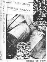
GOF 001 — I Think About Jackson Pollock
GOF 003 — Diary of a Shiteater
GOF 004 — Confessions of a Shit Addict
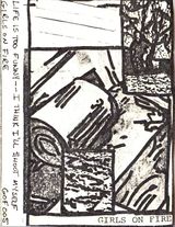
GOF 005 — Life is Too Funny — I Think I’ll $hoot Myself
(updated with new info on October 25, 2018)
GOF 006 — In My Blood
GOF 003 — Diary of a Shiteater
GOF 004 — Confessions of a Shit Addict
GOF 005 — Life is Too Funny — I Think I’ll $hoot Myself
(updated with new info on October 25, 2018)
GOF 006 — In My Blood
I liked the image of the trashcan as it seemed like a joke on Jasper Johns' ale cans (which was a joke on pop art), punk (“We're the flowers in the dustbin” — the Sex Pistols, God Save the Queen), Russian Constructivism with its emphasis on strong angular diagonal lines, Hans Hoffman’s push/pull (the rectangles of Jackson Pollock at work at the top right hand corner and then the painting itself in the bottom).
I would use my typewriter and the office copier at work to make the covers. At home, I would add the color elements in with magic marker and crayon. I used acrylic paint to paint over the labels.
The cutesy title lettering on Diary of a Shiteater was intended to be an ironic contrast to the cut up distorted sounds on the tape and the title itself. I did the lettering by hand on all the copies. I enjoyed doing it so the heart I added in was genuine good feeling.
Each cover was an alteration of the one before. Altered repetition. I mentioned before that I thought the covers were influenced by Andy Warhol and his use of repetition. But a lot of great artists have used/use repetition. Like the original Pop Art question about what makes today’s homes so appealing, what makes repetition so appealing? For me, it represents the infinite — the place that is no place and every place.

Then I put an end to infinity by putting my face on the cover of In My Blood. I wanted to do something antithetical to rock 'n' roll, so I dressed up in my office garb and make up and went to a head shot photo studio down the street from the FCA office. I think that I told the photographer that I needed some headshots for an album that I was doing to be released in France. She got all excited and did a great job.
When the Vita Nova label flaked out on me and didn’t send me any copies of the tape, I released it myself with what I would call now the “face and hand tattoo” cover.
When the Vita Nova label flaked out on me and didn’t send me any copies of the tape, I released it myself with what I would call now the “face and hand tattoo” cover.
Editor's Notes:
In early June 2018, I asked Leslie Singer why there wasn't a GOF 002 catalog number, and she replied:
Back in my Psychodrama days, Brett, Rob, and I would discuss the so-called sophomore syndrome that would affect bands— the first album is amazing, the second is a stinker and the third album is the return to form. I think that I must’ve taken that received wisdom to heart and decided to skip the whole second album thing and go right to the third album.
I asked her how she came up with the name "Girls On Fire":
I came up with the name Girls on Fire because I wanted a tough, cool name like one of the No Wave bands had. Also I had been just listening to the Talkings Heads' song, "Love Goes To Building on Fire". So I put the two together.
